But the idea of using this for the Liberator sleeve design fell out of favour when the concept was given more serious consideration, as Andy McCluskey mused: "You couldn't copy a Vargas-style Bomber Girl, it's all been seen before 50 years ago. What relevance has it to the 90s?" There was also a concern that the design would become the primary focus for the album - a statement about 'The Girl' when it was simply being used as a strong image.
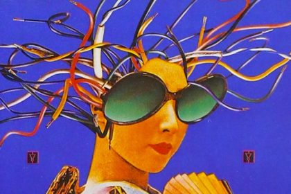
An alternative inspiration was put forward by Area (OMD's then sleeve design company) who showed Andy the work of photographer Stéphane Sednaoui (probably better known for directing music videos for the likes of Garbage, Depeche Mode and Björk) - in particular a striking image of a model wearing a metallic bodice with very bold colours. This visual idea wasn't a million miles away from the initial striking visual image of the Bomber Girl, yet was much more contemporary.
BUY NOW
https://amzn.to/4f0Yp7E
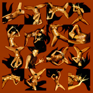
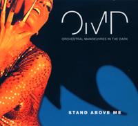
At first, Andy requested that Stéphane Sednaoui recreate the photograph as there was a concern that the original image might be too familiar to people. The images that were produced were certainly striking. The model was a 6ft tall Cherokee Native American from South Dakota. For the photo shoot she was dressed in a revealing bodysuit while her hands were embroidered with extended fingernails. The final images exaggerated her hair and the end result was amended and altered in various colour schemes to achieve the most effective result.
It couldn't be argued that the results of the photo session had a visual impact. But there was concern raised at meetings with the potential retail outlets that the revealing images were just a bit too risqué to be racked in typical high street retailers. Andy was also concerned about what people might say about the design: "What statement are OMD trying to make by having this semi-naked girl all over the sleeve?".
This resulted in a decision to go back and use the original photograph (although it's interesting to note that one of the reworked photographs of the second photo session was utilised for the sleeve design of first single 'Stand Above Me', although the choices were culled from the less risqué shots!).
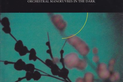
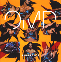
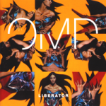
As an album, Liberator didn't quite match the success of Sugar Tax. "Pleasant, disposable stuff" was how one contemporary review summed the album up. Liberator's completed sleeve design. which features a gridlike structure of chosen images, is certainly effective, although with the benefit of perspective it probably lacks the power and simplicity of previous OMD album designs.
This is a revised and updated version of an earlier article.