| ORCHESTRAL MANOEUVRES IN THE DARK | ||||||||||||||||||||||||||||||||||||||||||||||

|
|
|||||||||||||||||||||||||||||||||||||||||||||
|
||||||||||||||||||||||||||||||||||||||||||||||
NOTES'Bunker Soldiers' features a chorus that actually spells out the title 'BUNKER SOLDIERS' as random letters and the same letters translated into numbers. 'Almost' also featured as the B-side to the single 'Electricity' and the album version was used on the third release of the single. 'Mystereality' features saxophone by Martin Cooper. 'Electricity' is the same version featured on the third single release. 'The Messerschmitt Twins' takes its title from a nickname for Andy and Paul. The phrase popped into Andy's head during the night prompting him to write a song about it. It was actually while researching Messerschmitts that Andy spotted a reference to the Enola Gay leading to fresh inspiration. 'Messages' is the original version and not the Mike Howlett produced single version. 'Julia's Song' dates back to Andy and Paul's time in The Id and features lyrics by Julia Kneale who was also in The Id at the time. 'Red Frame/White Light' was inspired by a telephone box used by the band outside The Railway Inn public house on the Wirral. 'Dancing' is an experimental piece whose unusual sound was created using Dalek I Love You's Kawai synth. 'Pretending To See The Future' was written about being in the music industry and specifically about signing a record deal. |
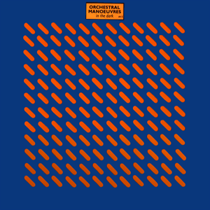
TRIVIAChester Valentino was a pseudonym for OMD's then-manager Paul Collister. The initial sleeve design featured a die-cut grid that revealed the inner sleeve.The album title was simply a sticker on the sleeve front. Ben Kelly had originally suggested the idea of using perforated sheet steel as a design idea to Peter Saville. Kelly had already used the same material as part of the design for Mr Howie - a boutique based in Covent Garden, London. Peter Saville once commented that "Talking Heads' Fear Of Music cover is the first definitive high-tech sleeve. The OMD sleeve is the UK version of the same thing. It is a perforated sheet metal pattern cut out of cardboard. It is the moment at which fashion comes in to play on design. Very clever that cover". The original sleeve design featured a blue outer sleeve combined with an orange inner with a 12 x 12 die-cut grid. When Peter Saville realised that the printers could change the colour combinations every 10,000 copies at no extra cost he opted for a black/pink variation. When DinDisc realised that OMD fans were buying the second version they asked for a third design. The complete sleeve variations were as follows:
Saville also rectified an earlier mistake by reducing the 12 x 12 grid scheme to 10 x 10 to prevent the inner sleeve from falling out. The design of the inner sleeve was also subtly altered for some releases. The first design featured the credits in a black 'L' shape on both the front and back of the inner sleeve. Some releases rotated the 'L' shape 90 degrees anti-clockwise but shrank the type for the credits so they appeared on one side only. After the die-cut sleeves were exhausted they were replaced with a plain sleeve that used the design featured on the cassette release. The inner sleeve also provided an address for an information service. People who wrote in received a letter plus free badges and stickers. |
